#Interface redesign
#research
Reducing friction at location selection page.
PharmEasy: Can we revamp our location selection page
and make it more user-centric?

2 weeks
Timeline
Product design intern
Role
About
In 2023, I had the opportunity to work with PharmEasy. I collaborated with a seasoned senior designer who served as my mentor. Together, we redesigned the location page as part of a UX overhaul project. This experience deepened my understanding of creating a more polished and user-centric interface.
Well, think about it this way,
Over 30,00,000 orders have been delivered safely— So, the location selection page is like the gateway for users to access tailored services based on where they are. It's what helps PharmEasy connect users to nearby pharmacies, delivery options, and localized healthcare info. So, having a smooth and efficient location selection process is key to making sure users get what they need quickly.
The previous design
Shortcomings with the previous solution
1
Limited Search Functionality
Inadequate or ineffective search features that make it challenging for users to find specific locations.
2
Ineffective Calls-to-Action (CTAs
Unclear CTAs that don't guide users toward the desired actions. For example, in the old design there’s no confirmation provided after the choice of selection.
3
Seamless Experience
Ensure a holistic design approach and stay current with market trends for a cohesive and relevant location page.
A Human Challenge
Isn't it intriguing how human preferences change over time? Our perception is deeply influenced by the visual elements we interact with. This tendency reflects a fundamental aspect of human psychology:
Our attraction to novelty and visual stimulation.
So, when an app's interface starts feeling a bit dated, it's not just about aesthetics; it's about staying attuned to users' evolving tastes and fulfilling their subconscious craving for that modernity.
Here, a re-design comes at necessity.
Project Milestones
1
Intuitive Location Selection
interface allowing users to effortlessly choose between their current location and saved addresses.
2
Advanced Search and Selection
Enhance the functionality of location search, ensuring accuracy and relevance in results.
3
Personalization Features
Introduce a personalized touch by enabling users to save and manage preferred delivery locations. Provide clear and concise guidance throughout the location selection process, reducing friction.
All in all, a holistic design and trend-driven interface.
Initial Phase

What failed & what are the limitations in the first draft?
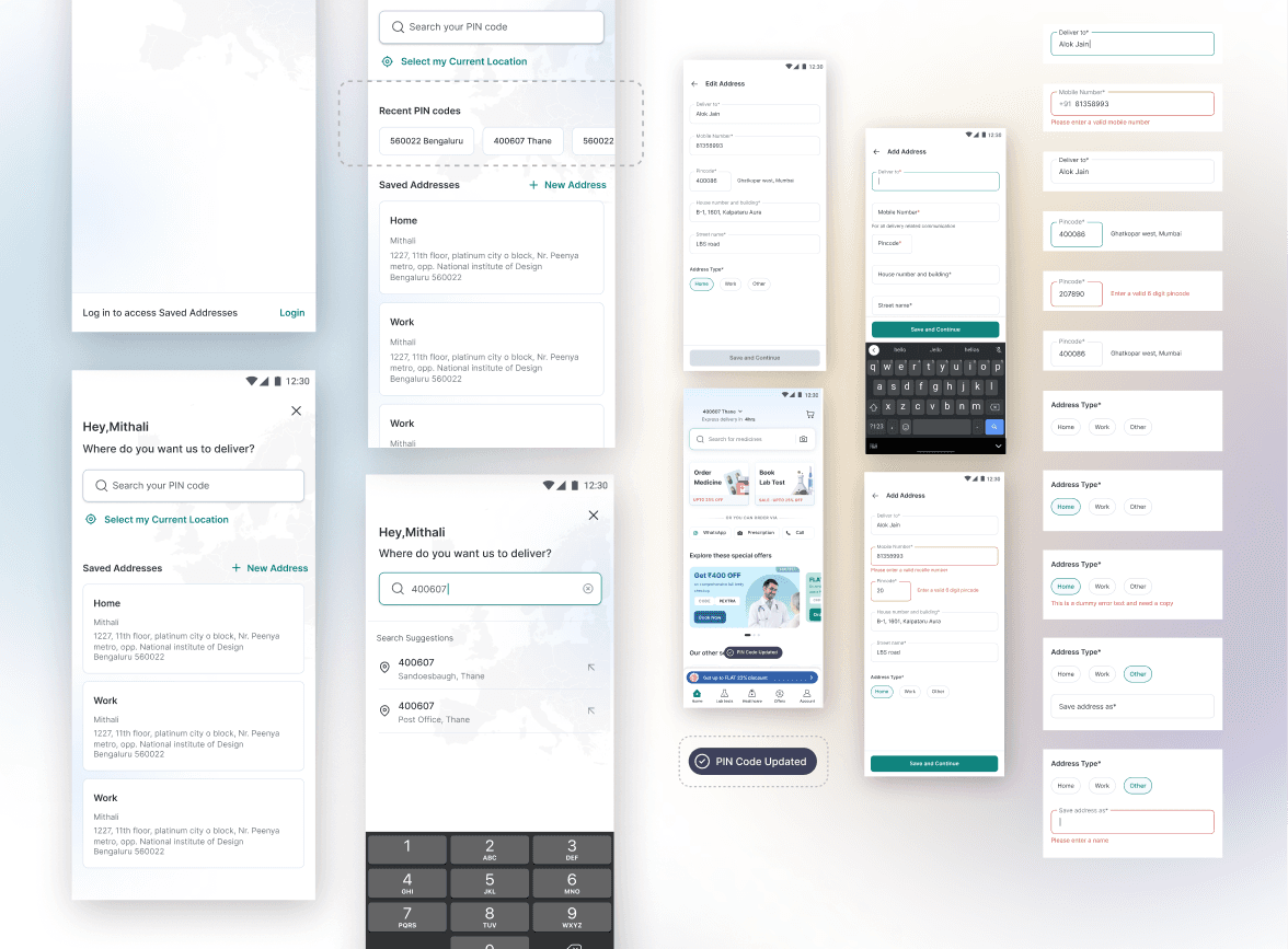
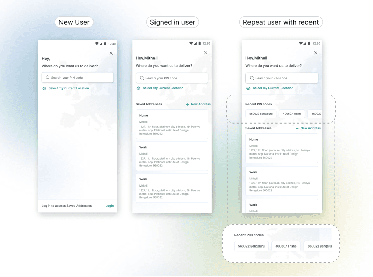
I wasn't constrained from brainstorming potential ideas to explore what could yield further improvements. However, at present, real-time location mapping isn't integrated. Users are provided with the alternative option to input their location using a search bar, typically by entering their pin code.
PharmEasy has a recognizable design style that users are familiar with and trust.
So, the question is - How do we re-vamp it without shaking the customers with a huge and unfamiliar change?
Remember our goal was to make it more intuitive for the users? Let’s build on that.
Even though we came up with many iteration, it was important to stick to the visual format of how the entire app will look.
Feature Enhancement Iterations

In this stage, we are also considering improvements to enhance the search functionality.
How do we simplify user-decision?
Individuals prefer making quick and effortless decisions rather than engaging in a more thorough and analytical decision-making process. This bias arises from the brain's inclination to take mental shortcuts to simplify complex information processing.
Given India's busy streets and intricate routes, we're working on ways to help users make better decisions and improve delivery accuracy. We're considering giving them nearby pin-codes to choose from, which would benefit both our B2B operations and delivery services.
This is a better iteration, but we need to make it more functional in other aspects…
Let's also think from the user's perspective. Besides just selecting their location, what other steps might they need to take? Perhaps they might want to edit an address or make adjustments. How can we simplify that experience as well?
Selected to ship!
Building for all use cases.
Edit & add new addresses

Imagine encountering a vending machine that simply displays "Error" when your selected item doesn't dispense. Instead of understanding what went wrong, you're left scratching your head. Now, contrast that with a vending machine that says, "Please insert correct change" or "Item sold out, please select another option." The latter messages not only inform you of the problem but also suggest a solution, making your vending machine experience much smoother. Similarly, in digital interfaces, specific error messages empower users to rectify errors promptly.
Clarity is key to guiding users effectively. Generic error messages like "Error occurred" offer little insight into what went wrong and how to fix it, potentially leaving users feeling frustrated and confused. Instead, providing clear and specific guidance tailored to the user's situation enhances the user experience. For instance, if a user forgets to fill in a required field in a form, a message such as "Please enter your address" or "This field is required" directs them precisely to the issue at hand. By offering targeted feedback, users are better equipped to understand and address errors.

Additional thoughts
The new design is also more visually appealing than the old design, the use of white space and clean lines makes the page look more modern and inviting. Research supports this notion, indicating that aesthetics can significantly influence users' perceptions of functionality. This phenomenon is known as the Halo effect, where users tend to believe something works well because it looks good.
Moreover, with a growing number of users relying on their mobile devices to access online platforms, ensuring a seamless and intuitive mobile experience has become bare-minimum for businesses like PharmEasy, being a mobile first app.
This case study underscores the importance of understanding user context and needs in designing solutions that effectively address the challenges of real-world environments. ( Example - solving search functionality)

My learnings
1
Don’t deviate from familiar patterns.
Use familiar interaction patterns that matches user’s mental models.
2
Focus on the core user job.
Reduce cognitive overload & reducing decision fatigue (saved address process).